The short answer
A pattern printed in IR-absorbing ink can be covered by ordinary colour ink. Under visible light the printed surface looks like a single, uniform colour patch with nothing unusual about it. Place the same print under a near-infrared viewer working at 780–980 nm, and the covered pattern reappears.
The masking layer has not failed to cover it. The reason is that most organic colour pigments are almost transparent in the near infrared. They absorb and scatter visible light strongly, but their absorption collapses once the wavelength moves past the visible range, and scattering efficiency also falls as wavelength increases. A thin film of colour ink stops the human eye. It does not stop near-infrared light.
That fact cuts two ways. The useful side is that you do not need an extra dedicated masking ink: a normal four-colour job can hide information in the artwork at almost no added cost. The risky side is that what you believe you have covered may not be covered at all — particularly if the masking colour contains carbon black, or if a white base coat sits between the pattern and the surface. Both change infrared contrast in ways that are not obvious from looking at the print.
The six wavelengths in common use — 780, 850, 880, 900, 940 and 980 nm — are not interchangeable. They differ in how hard the pattern is to mask, what the reader costs, and how covert the result really is. “It’s infrared” is not a specification.
1. A real printed sample: four red patches by eye, plus a hidden pattern under IR
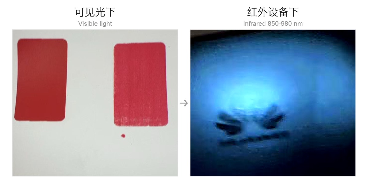
The construction of this sample is simple, only two layers:
- Bottom layer — the concealed graphic printed in IR-absorbing ink, in this case a simple line drawing;
- Top layer — red ink applied as a solid patch over the graphic, producing four patches that look identical to the eye.
Notice the crucial detail in the photograph. Under visible light the four red patches show essentially no difference in hue, lightness or gloss. An experienced press operator holding the sheet up to the light would be hard pressed to say which one has something underneath. That is the standard covert masking has to meet: not “well hidden”, but “nothing that invites suspicion”.
Bring the infrared viewer close and a second image appears — the outline of the pattern rising out of what had been flat red. This works not because the device is remarkable, but because the red ink gives way in the near infrared.
2. Why ordinary colour ink stops the eye but not the IR camera
Start by taking the word “opaque” apart. Opacity is not a property of a material; it is a behaviour at a particular wavelength. The same ink film that is a wall at 550 nm may be gauze at 940 nm.
2.1 Visible masking is not infrared masking
The human eye responds roughly from 380 to 780 nm. The detection bands discussed here, 780–980 nm, sit immediately beyond that range — between 1.0 and 1.25 times the wavelength of visible red. It sounds like a small step, but for light–matter interaction it is a different regime:
- Scattering falls with wavelength. When pigment particles are comparable to or smaller than the wavelength, scattering efficiency drops sharply as wavelength rises (in the Rayleigh regime, approximately as the inverse fourth power of wavelength). Going from 650 nm to 950 nm removes a large part of the scattering power, so the film blocks less light.
- The absorption band is not out there. The strong absorption of most organic colour pigments comes from electronic transitions of conjugated systems in the visible region. The photon energy at near-infrared wavelengths is no longer sufficient to drive those transitions, so absorption becomes weak.
Together these mean that a colour ink film thick enough to hide a pattern from the eye is often semi-transparent in the near infrared. You see a solid red. The IR camera sees a pale red filter.
2.2 The first variable is the pigment system, not how dark the colour looks
This is where practical judgement most often goes wrong. Whether a colour can hide a pattern in the infrared depends not on how dark it appears, but on whether its pigment absorbs in the target band.
| Masking material | Under visible light | At 780–980 nm | Effect on the hidden pattern |
|---|---|---|---|
| Organic colour pigments (red, yellow, magenta; azo, phthalocyanine and similar) | Strong absorption, good opacity | Absorption drops sharply; scattering falls too | Fails to mask — the pattern still reads in IR. This is exactly why the approach works |
| Carbon black | Strong absorption across the visible | Strong absorption from UV through near IR | Masks successfully — but swallows the pattern as well; nothing reads in IR. Carbon black is a natural IR blocking layer |
| White pigments (titanium dioxide and similar) | High scattering, high opacity | Scattering and reflection remain high | Destroys contrast — lifts the background and compresses the difference the pattern depends on |
| Metallic pigments (aluminium, pearlescent) | Metallic lustre, strong opacity | High near-infrared reflection | Unpredictable — a bright reflective background washes the pattern out |
Read that table carefully and two common puzzles resolve themselves:
- Why does red work in the photograph? Red is an organic pigment system: strong absorption in the visible, weak absorption in the near infrared. That combination is precisely “blocks the eye, lets IR through”.
- Why does switching to black break it? Carbon black absorbs strongly across the whole near infrared. The masking layer and the pattern layer both go dark, and the camera sees neither. If you want a masking layer, keep carbon black out of it.
2.3 Second variable: film thickness
The same red ink, printed thin or printed heavy, can give opposite results in the infrared. A thicker film forces near-infrared light through more attenuating material, so masking improves; at offset levels (around 1 µm) near-infrared light passes almost untouched. This means one set of plates and one ink can still produce “this batch reads, that batch doesn’t” simply because ink film weight drifted.
2.4 Third variable: the detection band
Longer wavelengths are harder to mask. The same red film may still retain enough absorption at 780 nm for the pattern to look faint, while at 980 nm absorption has essentially gone and contrast is at its strongest. “Is it masked?” never has an absolute answer; it only has an answer at a stated wavelength and ink film weight.
3. 780–980 nm: what actually separates the six bands
The sample above uses an IR-absorbing ink system that can be tuned across 780–980 nm. In real projects, however, these six wavelengths are not equivalent. They determine who can read your pattern, what the reader costs, and how much masking the top layer has to provide.
| Band | Relation to visible light | Typical source / reader | Silicon sensor response | Difficulty of masking with ordinary colour ink | Covertness |
|---|---|---|---|---|---|
| 780 nm | Sits at the visible limit (about 780 nm) | Near-IR LED, phone camera with the IR-cut filter removed | Strong | Relatively easy (pigments still absorb a little) | Low |
| 850 nm | About 70 nm beyond visible | Security IR illuminators, industrial cameras, most handheld viewers | Good | Moderate | Moderate |
| 880 nm | About 100 nm beyond visible | Some industrial sources and lasers | Moderate | Moderate to hard | Moderate to high |
| 900 nm | Near the silicon roll-off | Industrial camera with a strong source | Falls off noticeably | Hard | High |
| 940 nm | About 160 nm beyond visible | Consumer IR LEDs (remotes, CCTV illumination, face recognition) | Weak | Hard | High |
| 980 nm | About 200 nm beyond visible | InGaAs camera (900–1700 nm), pump lasers | Essentially none | Very hard | Highest |
3.1 780 nm: easiest to read, easiest to disturb
At 780 nm you are still on the doorstep of visible light, so the barrier to detection is very low — a phone camera with the IR-cut filter removed plus a 780 nm LED will do the job. The price is the weakest covertness. Because the band sits so close to red, deep red and crimson inks still absorb appreciably, so the background darkens along with the pattern and contrast is difficult to push high. Stray visible light also leaks into the shot more readily.
Suited to in-house quality control, quick channel verification, and cost-sensitive one-off features.
3.2 850 nm: the balance point for cost, covertness and availability
850 nm is one of the two mainstream wavelengths for security illuminators and industrial cameras. Silicon sensors still respond well, components are cheap and widely stocked, and virtually every handheld IR viewer supports it. If you have no other constraint, 850 nm is the default answer — it satisfies “easy to buy a reader”, “easy to read the pattern” and “invisible to the naked eye” at the same time.
3.3 880 nm and 900 nm: the transition zone, driven by the reader
These sit where silicon response slides from “good” to “struggling”. An 880 nm setup can usually borrow 850 nm hardware, since camera response bandwidth is broad and only the illuminator changes. From 900 nm upwards you need a stronger source or a more sensitive camera, or the pattern turns grey and its edges blur. Neither band has an ecosystem of its own; they are chosen because a customer already owns a specific device, not by preference.
3.4 940 nm: the most widely available hardware, but cheap does not mean easy to read
Here is a counter-intuitive point that trips people up. 940 nm is the most common infrared wavelength in consumer electronics — remote controls, CCTV night vision and face-recognition illumination all use it — so sources and modules are extremely cheap and easy to obtain. But silicon image sensors have very low quantum efficiency at 940 nm, and a modified phone camera usually cannot produce a usable image there. A dedicated 940 nm enhanced camera is required.
Put another way: at 940 nm, “cheap hardware” refers to the illuminator, not to the detection. Its real strengths are high covertness and the fact that a source can be set up almost anywhere on site.
3.5 980 nm: highest covertness, highest barrier
980 nm lies outside the useful response range of silicon, so an InGaAs camera (900–1700 nm) is mandatory. Equipment cost is the highest of the four options and usually comes with a dedicated source and light-tight enclosure. In exchange you get the highest covertness available: ordinary phones, ordinary CCTV and ordinary handheld viewers cannot read it at all, leaving a counterfeiter with no low-cost way to replicate the verification.
One practical detail is worth flagging: water has an absorption band near 970 nm. Paper moisture content and ambient humidity can slightly affect signal stability at 980 nm, so the same printed batch may measure differently in a humid season than in a dry one. Any quantitative acceptance criterion should account for this.
4. Choosing a band: three decision paths
The right band is not the most advanced one; it is the one that matches the reader. These three paths cover most cases.
| Your situation | Decision | Why | Cost |
|---|---|---|---|
| The reader is already fixed (customer equipment, or an industry-specified band) | Follow the reader and align the ink’s absorption peak to it | An offset peak collapses contrast — the pattern becomes “visible but unreadable” | Almost none; the formulation is simply tuned to that band |
| Reader not fixed, cost matters | Choose 850 nm | The most mature ecosystem: handheld viewers, security cameras and industrial cameras all cover it | Moderate covertness; a modified phone can still read 780–850 nm |
| Reader not fixed, covertness matters (high-value documents, core brand protection) | Choose 980 nm, or a 940 + 980 dual-band design | Sits beyond silicon response, so ordinary hardware cannot read it | Requires an InGaAs camera, so detection is expensive; 980 nm is affected by paper moisture |
Beneath all three sits a more fundamental question: who is allowed to read this pattern?
- If only your quality department will read it, choose a long wavelength and set the barrier as high as possible;
- If distributors or market regulators must verify on site, choose 850 or 940 nm so a reader is easy to obtain;
- If end consumers are meant to take part, do not rely on infrared alone. Add an overt feature such as UV fluorescent ink that anyone can see, and keep infrared as the second-level check.
5. Three ways to build the masking layer
The photograph uses the first approach — plain colour ink as the mask. It is the cheapest of the three, but not the only option.
| Approach | Method | Advantages | Risks | Best for |
|---|---|---|---|---|
| A. Ordinary colour ink as mask | IR-absorbing pattern underneath; a solid patch of red, yellow or magenta from the process set printed over it | No extra ink station or process step; blends completely into existing artwork; lowest cost | Pigment system is uncontrolled (any carbon black breaks it); ink film variation directly changes readability; batch-to-batch colour drift creates batch-to-batch differences | High-volume packaging, cigarette and spirits labels, cosmetics cartons — anything already printed four-colour |
| B. Dedicated IR-transparent masking ink | A separate station prints a layer that is opaque in the visible and highly transmissive in the near infrared | Most controllable: opacity and transmission can be designed independently; surface colour can be matched | Adds a station and a process step, raising cost; compatibility with the layer below must be validated | High-covertness documents, cards and credentials, core brand protection |
| C. Composite masking | Ordinary process ink for appearance, plus an IR-transparent ink on top to close the gap | Best of both: maximum design freedom with reliable IR covertness | Most process steps and the thickest total film; the “opaque to the eye, transparent to IR” window must be re-established | Premium products where appearance cannot be compromised and covertness cannot be sacrificed |
For the selection criteria and film-thickness comparison of approach B, see the companion article Combining IR-absorbing and IR-transparent inks. This article concentrates on approach A and on the trade-off between A and B, because most real projects start from ordinary colour-ink masking.
Note that this section sorts out which ink does the masking. Once the ink is chosen, how the mask is printed — a heavy film on a coarse screen, or a varnish first and a thin colour on top — matters just as much for covertness, if not more. See the next section.
6. Making the pattern more invisible: keep the ink transparent first, then choose a masking route
The previous section dealt with which ink does the masking. This one deals with how it is printed. The same IR-absorbing ink, printed two different ways, can differ by an order of magnitude in covertness. Two things have to be solved at once: the pattern underneath must not be visible, and the mask itself must not betray itself to the touch or under raking light.
6.1 The precondition: the IR-absorbing ink itself has to stay reasonably transparent
This is the most commonly missed point. The intuition is that the IR layer will be covered anyway, so it may as well be printed as solid as possible. The result is exactly the opposite: the more opaque the IR layer, the harder it becomes for the mask above to hide it.
There are three reasons, all on the visible side:
- The base colour changes. Masking ink is not perfectly opaque — if it were, nothing would read in the infrared either. Where the IR layer beneath is darker or greyer, the masked area comes out one step lower in lightness than the blank area, and the outline reappears as a faint tonal difference.
- Haze rises. Pushing pigment loading up to absorb more in the near infrared, without matching dispersion, produces grey haze in the visible first. High-lightness masks such as red and yellow hide this least — a patch that looks dirty is easier to catch than one that merely looks dark.
- The step gets taller. A screen-printed film has thickness. The thicker the IR layer, the bigger the step between pattern and blank; the mask has to climb that step, its film thins at the edge, hiding power drops, and the outline shows first.
So the right direction is thin and effective, not thick and solid: raise absorption efficiency (peak matched to the target band, particle size and dispersion under control) and bring the IR film weight down. The test is simple — the IR layer should be laid down only to the absorption it needs at the target band. Anything beyond that adds nothing to readability and actively works against covertness in the visible.
| The same IR pattern layer | Visible side (covertness) | Near-infrared side (readability) |
|---|---|---|
| Film weight | Thinner is better: smaller step, less shift in base colour | Needs enough absorption, so it cannot be infinitely thin |
| Pigment loading | Too high brings haze, especially under red or yellow masks | Loading is one source of absorption strength |
| Dispersion | Coarse particles scatter visible light and dirty the mask | Agglomerates reduce effective absorption |
| Conclusion | Win on absorption per unit of film thickness, not on ink volume | |
6.2 Route one: thick-film masking — stop the visible light with thickness
The commonest and most direct approach: print the masking colour straight over the IR pattern layer, with no interlayer, and rely on enough film thickness to block the visible.
In screen printing this normally means a mesh of around 150 threads per inch. The lower the mesh count, the larger the opening and the higher the ink deposit, so a single pass lays down a comparatively thick film with a visible build on the surface. The route works because hiding power comes from the thickness itself, not from a specially designed pigment system, which makes it the least demanding on the ink and the easiest to implement.
But thickness cuts both ways, and there is no going back:
- More thickness means less signal. Blocking visible light and blocking near infrared use the same mechanisms (absorption plus scattering), only at different efficiencies. By the time the film is thick enough to satisfy the eye, it may already have consumed half the signal at the target band.
- Pressure and speed decide the actual deposit. The same 150-mesh screen on a different press, with a different squeegee angle or hardness, or at a different print speed, gives a different film weight. A proof that passes on press A can drift out of the window on press B in production.
- Large solids print unevenly. Uneven squeegee pressure and screen tension produce thick centres, thin edges or squeegee bands, and drying shrinkage and levelling redistribute the film once more.
- The step is still there. With no interlayer to level it, the step over the pattern area has to be covered by the colour ink alone, so the only direction is thicker — the “print it heavier” spiral.
So 150 mesh is a common starting point, not a specification. Print a proof at around 150 mesh, measure the film-weight range that still reads at the target band, then fix the process window against mesh, squeegee and viscosity, with allowance for production variation.
6.3 Route two: a varnish interlayer — level the surface, then print the colour
The second approach inserts a clear varnish between the IR pattern layer and the masking colour, making four layers:
- substrate;
- pattern layer in IR-absorbing ink;
- varnish (clear, covering the whole pattern area);
- surface colour ink.
Its defining characteristic is that the colour ink does not have to be thick to be invisible. The reason is not a greater total film weight but the fact that the surface the colour ink forms on has changed.
First, what happens without the varnish. The IR pattern is printed locally, so the pattern area stands one film thickness above the blank. Colour printed directly onto that stepped surface varies in thickness: full over the flat, thin at the edge of the step. Hiding power is proportional to film weight, so the outline appears as a lighter rim. Suppressing that rim means adding more colour — which is precisely why route one keeps getting thicker.
The varnish does three things:
- It levels the step. Varnish flows well and its solids can be adjusted, so it fills the local difference in film build and leaves one continuous, flat printing surface. With the step gone, the colour film no longer has to climb.
- It isolates the layers. Solvent or vehicle from the colour ink can penetrate and swell the IR layer, shifting its absorption or its hue — and in the visible that shift is exactly the ring of “shadow” described above. The varnish separates the two and acts as a protective layer for the IR ink.
- It lets a thin film hide evenly. Colour printed on a flat surface forms an even film, so hiding power is uniform. Since there is no thin spot to make up for, total film weight falls.
In other words route two does not overpower the pattern with more ink; it removes the need to make up for thickness with hiding power. With a thinner total film the near infrared is attenuated less, and the readable window is actually wider than on route one.
The route imposes four hard requirements on materials and process; miss one and the result is a visible defect:
- The varnish must be genuinely clear. No matting agents, coarse waxes or excess filler — they scatter visible light and make the colour look hazy; and no near-infrared absorbing additive at all, which would consume the signal itself.
- It must level. A varnish that does not flow carries the outline of the pattern with it, and the levelling effect is lost. Viscosity, solids and application method (screen, flexo or roller coating) all have to suit the artwork.
- The layers must be compatible. The varnish must not swell or lift the IR layer, and its surface energy must let the colour ink adhere. UV varnishes that cure very smooth often give poor adhesion for the colour, so corona treatment or a different system may be needed.
- Coverage must be complete. The varnish has to cover the whole pattern area with registration allowance. A missed patch or a pinhole lets the step reappear in that one place, producing a broken “ghost line” that looks worse than a uniformly visible pattern.
6.4 Choosing between the two routes
| Item | Route one: thick-film masking (about 150 mesh) | Route two: varnish interlayer |
|---|---|---|
| Layer structure | Substrate / IR pattern / thick colour | Substrate / IR pattern / varnish / colour |
| Screen | About 150 mesh: coarse, high deposit | Finer mesh for both varnish and colour; colour need not be thick |
| Source of hiding power | The thickness of the colour film | A flat surface plus an even colour film |
| Surface | Film step present; build visible under raking light | Step levelled; flat surface, uniform gloss |
| Total film weight | High | Low |
| Near-infrared readability | Attenuated by the thick film; narrow window | Less attenuation; wider window |
| Steps and cost | Few: one colour pass | More: one varnish pass plus a drying or curing step |
| Main risk | Ink-weight variation between batches; over-application kills readability | Missed varnish or pinholes; interlayer compatibility and adhesion |
| Best for | Large solid patches, simple artwork, cost-sensitive work | Fine detail, halftones and gradients, high appearance demands |
The two routes can be combined: thick-film masking first, then a varnish to flatten it. But the combined stack is the thickest of all, so the window has to be re-established at the target band rather than inherited from either route alone.
There is also a quick field test. Hold the print at a raking angle: if the pattern area shows a visible build or a gloss difference, the step has not been dealt with — adding colour at that point is paying a tax in thickness, and a varnish should be considered. If the surface is perfectly flat but the IR signal is weak, the mask is already over-applied and the film should come down, not go up.
7. Five process parameters that decide the outcome
Once the principle is clear, these are the five things that actually cause rework.
7.1 White base coat: the biggest hidden trap
Many packages add a white base coat between the pattern layer and the surface to make colours appear more vivid. That layer helps you in the visible and ruins you in the near infrared. Titanium dioxide and similar high-scattering pigments scatter and reflect just as strongly in the near infrared, lifting the image background and compressing the difference the pattern depends on. A crisp outline turns grey.
When building an IR-hidden pattern, do not place a white coat between the pattern layer and the masking layer. If the artwork needs a white base, put it beneath the pattern layer, not above it.
7.2 Print order and missed coverage
The IR-absorbing layer must sit entirely beneath the masking layer. Local gaps, a margin left blank, or a pattern that runs past the mask will expose the concealed information under visible light — worse than a pattern that fails to read in IR, because it advertises that a security feature exists at all.
7.3 The film-weight window: narrow, and must be measured
The masking layer is squeezed from both sides:
- Too thin — it fails to hide the pattern from the eye, and covertness drops to zero;
- Too thick — near-infrared light is attenuated as well, nothing reads in IR, and the function drops to zero.
The usable window lies between the two, and its width depends on the pigment system, the band and the substrate. The classic field failure is a proof that lands neatly inside the window followed by a production run that drifts out of it through ink-weight variation, producing “this batch reads, that batch doesn’t”. So a proof is not only about confirming that it reads; it is about confirming how wide the window is.
The window is not a fixed property either. With the same pigment system and band, levelling the step with a varnish and then printing a thin colour gives a wider window than masking directly with a heavy film (see 6.3 and 6.4). Choose the right route and the window stops being something you must hit exactly and becomes something with margin in it.
7.4 Registration allowance
The mask must fully cover the pattern with a registration allowance. Too little allowance and normal register variation leaves a fringe of “shadow” around the pattern — which reveals where the concealed area is. This is where high-speed web offset is most likely to bite.
7.5 The substrate is part of the result
Change the substrate and you must retest. Coating weight, fibre structure and filler type all alter near-infrared reflectance, and plastic films (PE, PET) and metalised cardstock differ even more. No paper specification can substitute for printing on the actual substrate and photographing it at the actual band.
8. Detection hardware and how to accept a job
| Device | Usable bands | Cost | Where it fits | Limitations |
|---|---|---|---|---|
| Handheld IR viewer (as used for the sample) | Mostly 850 / 940 nm, some support 980 | Medium | Production line sampling, warehouse checks, field inspection | Small field of view; imaging depends on its own illuminator and on blocking ambient light |
| Modified phone camera (IR-cut filter removed) | Mainly 780–850 nm | Low | Rapid pre-screening, sales-side self-checks | Essentially useless above 940 nm; visible-light image quality degrades after modification |
| Security camera (850 / 940 nm illumination) | 850 / 940 nm | Low to medium | Large-area screening, logistics and warehouse lanes | Ambient light must be controlled; resolution and contrast depend on illumination uniformity |
| InGaAs industrial camera | 900–1700 nm | High | Mandatory for 980 nm; quantitative analysis and R&D validation | Expensive, needs a dedicated source and enclosure, higher operating skill |
8.1 Acceptance is not “can I see it?”
The most common acceptance failure in infrared security is a job that reads perfectly in the lab and cannot be read in the customer’s hands. Almost always the criterion was too loose: someone checked whether the pattern was there, not whether there was any margin left.
Four steps are enough:
- Fix the conditions — same device model, same lens distance, same source intensity and exposure. Do not judge by waving a handheld viewer around;
- Test three lighting conditions — dark room, normal interior light, and strong ambient light such as beside a window. Stray light suppresses contrast noticeably, and this is the step people skip;
- Judge the edges, not the whole — whether the pattern outline stays sharp and legible says far more about process margin than whether the centre is recognisable;
- Sample across batches — at least three batches and three sheets per substrate. Any batch that fails means the window is too narrow: go back to ink weight or change the masking approach.
9. Typical applications
- Cigarette and spirits packaging — hide a brand mark or batch code inside existing four-colour artwork; invisible to the eye, verifiable on the spot with a handheld viewer;
- Tickets and credentials — concealed graphics on tickets, certificates and ID cards to defeat copying and re-photographing;
- Cosmetics and pharmaceutical cartons — add a covert verification layer without any compromise on shelf appearance;
- Electronics and automotive parts — concealed batch or serial numbers on component surfaces for authentication and traceability;
- Channel control — a covert mark distinguishes authorised channels from diverted stock, and cannot be identified and copied by inspection;
- Stacking with overt features — infrared hides, UV fluorescent ink verifies, OVI optically variable ink shows. Together they form a three-tier system covering the naked eye, ultraviolet and infrared.
10. Frequently asked questions
Why is a pattern printed in IR-absorbing ink invisible once ordinary colour ink is printed over it?
Because the masking layer absorbs and scatters enough visible light to block what the pattern reflects back. The eye receives only the colour of the masking layer and sees a uniform patch with no clue that anything lies beneath.
Why can some colours mask in the infrared and others cannot?
It depends on the pigment’s behaviour at that wavelength, not on how dark the colour looks. Organic colour pigments (red, yellow, magenta) absorb strongly in the visible and weakly at 780–980 nm, so they fail to mask and the pattern still reads in IR. Carbon black absorbs strongly from UV through near IR: it masks successfully but swallows the pattern too. White pigments scatter strongly and lift the background, compressing contrast, while metallic pigments reflect so much that the pattern is washed out.
How do I choose between 780, 850, 880, 900, 940 and 980 nm?
Start with the reader. If the customer already owns equipment, follow its band and align the ink’s absorption peak to it. If the reader is open and cost matters, choose 850 nm, which has the most mature hardware ecosystem. If covertness comes first, choose 980 nm — it requires an InGaAs camera, so ordinary hardware cannot read it. The 880 and 900 nm bands are normally chosen only when a specific device already exists.
940 nm hardware is the cheapest — does that make it the best choice?
Not necessarily. What is cheap at 940 nm is the illuminator, since remote controls and CCTV illumination all use it. But silicon sensors respond weakly at 940 nm and a modified phone camera usually cannot produce a usable image, so a dedicated 940 nm enhanced camera is needed. Its genuine advantages are high covertness and the fact that a source can be deployed almost anywhere on site.
Can I detect an infrared hidden pattern with an ordinary phone?
Only after removing the camera’s infrared cut (IR-cut) filter. A modified phone can read patterns at 780–850 nm. An unmodified phone cannot, because the IR-cut filter exists precisely to remove near-infrared light. Above 940 nm a modified phone is essentially useless.
Is a thicker masking layer always more covert?
No. The mask is constrained from both directions: too thin and it fails to hide the pattern from the eye; too thick and it attenuates the near infrared as well, so nothing reads in IR. The usable window lies between the two and its width depends on pigment system, band and substrate. It must be measured, not estimated.
There are two established routes. Thick-film masking uses a coarse screen — around 150 mesh — to lay down a heavy colour film in one pass and block the visible by thickness alone, which makes it sensitive to mesh, squeegee and viscosity variation. Varnish interlayer masking prints a clear varnish over the IR pattern to level the film step, then a surface colour that does not need to be thick, giving a wider readable window. The first involves fewer steps and lower cost; the second adds a pass but decouples thickness from hiding power, so it holds up better from batch to batch.
Why does a thin colour film hide the pattern once a varnish is printed underneath?
Because the varnish supplies no hiding power of its own — it changes the surface the colour ink forms on. The IR pattern is printed locally and stands one film thickness above the blank. Colour printed straight onto that step thins at the edge, hiding power drops there, and the outline shows as a lighter rim, which can only be suppressed by adding more colour. A varnish pass levels the step first, so the colour forms an even film of even hiding power and a thin layer suffices. The varnish also blocks the upper layer’s solvent from swelling and lifting the IR layer. The preconditions are a genuinely clear varnish that levels, compatible layers, and coverage with registration allowance.
Can IR-absorbing ink be used together with UV fluorescent ink?
Yes, and it is a common pairing. The two are verified by different means (UV lamp versus IR device) on non-overlapping bands, so they can be placed in separate areas or overprinted in the same area to build a multi-tier system — invisible by eye, visible under UV, readable in IR. The compatibility of the two inks and their curing order need to be checked.
How do I get a proof, and how are samples supplied?
Tell us four things: substrate type (paper, film or card, with grammage), printing process (offset, screen, UV inkjet or flexo), target detection band, and masking approach (150-mesh thick-film mask, varnish plus surface colour, or a dedicated IR-transparent masking ink). We will recommend or formulate an IR-absorbing ink accordingly. Printed proofs are supplied free of charge so you can verify both the infrared image and the visible-light covertness on your own equipment before placing an order.
11. About SJH Ink
Shenzhen Sojhonink Co., Ltd. specialises in the development and manufacture of anti-counterfeiting inks. The company is a member of the Radiation Curing Branch of the China Printing Technology Association, operates a capacity of close to one thousand tonnes per year, and supplies products conforming to EN71.3 and REACH environmental standards. Main product lines:
- IR-absorbing, IR-transparent and IR-excitation inks — customised for 780 / 850 / 880 / 900 / 940 / 980 nm and other bands, for covert codes, concealed graphics and masking-based security;
- UV invisible fluorescent ink — verified under UV light, widely used on tickets and documents;
- OVI optically variable ink (OVMI, chameleon ink) — colour shifts with viewing angle, banknote-grade security;
- Water-based thermochromic, photochromic and glow-in-the-dark inks — overt features that anyone can verify.
We support screen printing, offset, UV inkjet, flexo and gravure, and can customise formulations and supply printed proofs against your substrate, band and detection equipment.
- Website: www.sjhink.com
- Tel: +86 13510998453 / +86 13510514531
- Email: sz_qhy@hotmail.com
- Address: No. 14 Fuxing Road, Pinghu, Longgang District, Shenzhen, China
If you are evaluating a covert infrared solution, send us your substrate and we will print a proof for you to test. Further reading: Combining IR-absorbing and IR-transparent inks, what IR-absorbing UV ink is, how IR-excitation ink works and how it is detected, why IR effect disappears after UV curing, the IR-excitation ink product page, the anti-counterfeiting ink selection guide and the ink glossary, or contact us for a quotation and technical support.
Published by Shenzhen Sojhonink Co., Ltd. Reproduction requires attribution.