Liquor Packaging Security: OVI + Thermochromic Combo
Home › News › Liquor Packaging Security: OVI + Thermochromic Combo
2026-08-04 published · updated
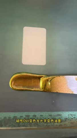
SJH OVI ink (copper-green): shifts between copper and green with viewing angle — premium security for liquor packaging.
Liquor brands face serious counterfeiting. The OVI + thermochromic combo balances security, premium aesthetics and marketing value.
OVI Ink: Premium Security
OVI shifts color with viewing angle, verifiable by naked eye without devices. The shimmering effect itself decorates the bottle and is nearly impossible to fake.
Thermochromic Ink: Security + Interaction
Hand-warmth reveals hidden text (winery name, vintage) on the label — adding a security dimension and creating a ritual moment.
Selection, detection, printing and ordering — answered.
Why is an OVI plus thermochromic combination recommended for spirits packaging?
Because it satisfies three demands at once: protection strength, premium feel and marketing value. The iridescence of OVI is decorative in its own right and sits well beside hot stamping and spot UV, while thermochromic adds interaction and ceremony — together they protect and give people something to talk about.
What does OVI contribute on spirits packaging?
High-end overt protection. It shifts between two colours with viewing angle and is visible in daylight with no equipment, so a consumer can check it by tilting the bottle, while the optical interference effect is very hard to counterfeit.
How is thermochromic used interactively on a spirits label?
Through hand-warmth reveals — holding the bottle for a few seconds exposes the distillery name or vintage. It adds a verification dimension and a sense of occasion, with the trigger temperature customised to the design.
How should the bottle, the closure and the back label divide the work?
A common split: OVI on the main front label for overt premium protection; UV invisible ink on the neck seal for covert protection and identity coding; thermochromic on the promotional or back label for interactive marketing.
Does heavy security compromise packaging aesthetics?
That is exactly what the combination solves. OVI is decorative by nature, UV invisible ink is completely invisible in normal light, and only the thermochromic element is a visible design decision — layered together they add quality rather than clutter.